The Practice of Design


As a designer, I believe in the balance of aesthetics and usability. I believe in building concepts that satisfy users and enhance the way they work, play, interact and live. I find that in order to deliver the best experience, designers need to be willing to venture into new territory, try a different approach and know when to rely on best practices.

 
Group 21.jpg
 
sonicwall-logo-330.jpg
 

Firewall Management Application Design

MySonicWall product detail view before redesign

SonicWall provides network security solutions for a wide range of deployments and IT needs. The design team at SonicWall was responsible for redesigning one of their existing management applications called MySonicWall. This web app allows administrators to manage product licenses, services, support and firmware.

Conducting User Interviews & Concept Creation

In order to successfully redesign the MySonicWall UI, our design team started by interviewing users from a variety of network deployments in order to understand their workflows, needs and use cases. After uncovering these needs and goals we were able to start creating our initial design concepts.


New product detail workflow

Product detail

Product detail drawer


A Simplified Product View

Based on our research and user interviews, our team was able to uncover the basic and most important goals of network administrators who use MySonicWall to manage their products. These included the ability access product details, firmware status and available downloads as well as licensing details and firmware cloud backups. The result is a product tile with tabbed views for each section, with corresponding functions that allows a user to quickly understand the product status and what updates are needed if any.

Product detail (Firmware tab)

Product detail (Licenses tab)

Product detail (Cloud backups tab)


Concept Walkthroughs & Collaboration With Engineers

After creating a simplified product view, our team was able to put our designs in front of actual users in order to get critical feedback, which was used to refine our designs. We also worked closely with engineers to implement and adjust our designs if necessary based on different requirements. Moving forward, our team continued to redesign different sections of the UI in order to simplify the application as a whole and deliver a greater user experience. To the right you can see different examples of other redesign areas.


download.png
 

Designing for Enterprise Network Management Software

HiveManager web application

Aerohive provides Network Administrators and IT professionals with an interface that allows them to manage their entire WiFi network in one place. Designing an interface that easily allows Admins to monitor, diagnose and troubleshoot network related problems can be challenging but is imperative for many users.

In order to increase the usability and create a one of a kind user experience, our design team was tasked with redesigning the alerts and notifications for Aerohive's interface.


Network Admin Persona

Design Thinking & Research

We began our initial research by focusing on both our primary and secondary personas. It was important to solve the problems of both technical and non-technical users.

One of the most important tools we used to define the product requirements was a Design Thinking exercise. By collaborating with Product Managers, Front End and Back End Engineers, as well as Technical Writers, the UX team was able to focus on several key use cases and user stories surrounding alerts and notifications.

1. Providing network admins and IT professionals with timely notifications, regardless of where they are is important to quickly solving many problems.

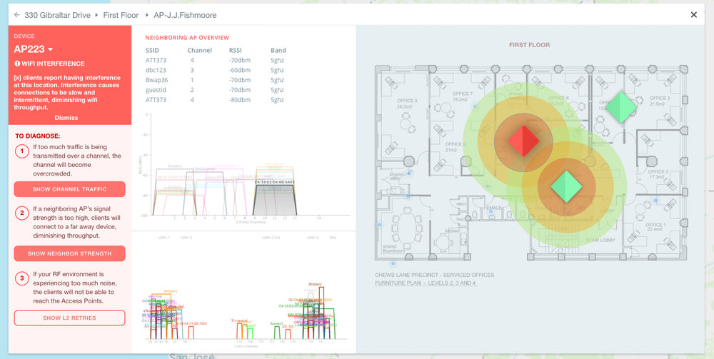
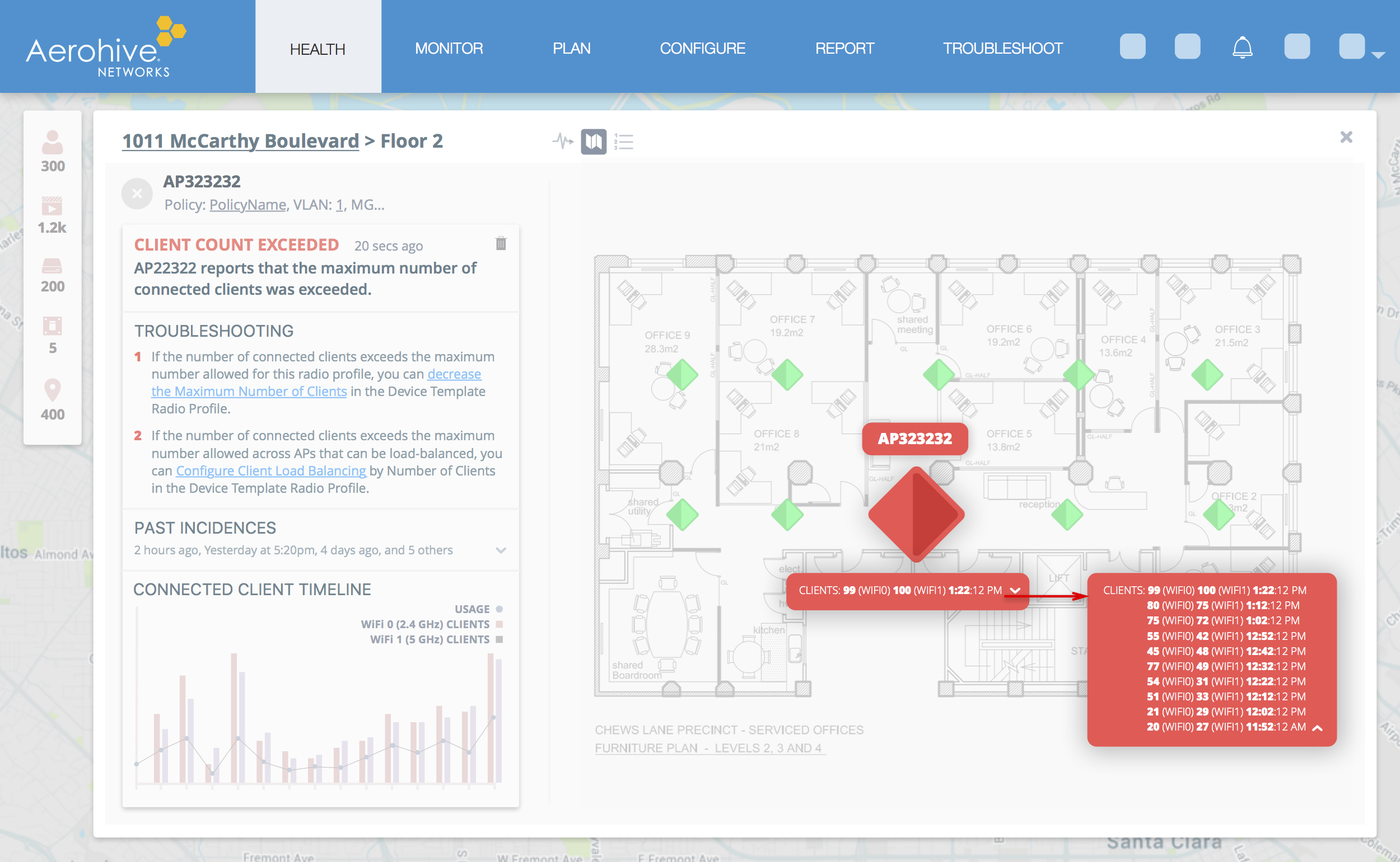
2. Displaying alert information that is easy to understand and digest can change the user experience from frustrating and confusing to efficient and delightful.

3. Giving our users the ability to easily troubleshoot network issues with guided workflows empowers and enables them to successfully manage their entire network.


Ideation & Mockups

Once we had determined our requirements, it was time to hit the ground running and start designing the initial concepts for Aerohive's alert and notification system. Our process started with several rounds of whiteboard sketches, followed by visual mockups.

Alert widget redesign

Alert widget


User Feedback, Iteration & Solutions

After we crafted the initial designs for alerts and notifications, our next step was to put these concepts in front of actual users and domain experts to gather critical feedback in order to iterate on our designs.

This phase of the design process was extremely important because it helped the design team understand where we could further improve the user experience. From these feedback sessions, we were able to clean up our designs and deliver a powerful alert system and troubleshooting tool.


indiegogo_logo_detail.png
 

Creating a new Navigational System

The Design Equation team (myself, Micah Bennett and Danielle Malik) proposed three new navigational schema and an Information Architecture which supports current campaign trends, user behaviors, and Indiegogos growing brand position. Our 3 week sprint included a research phase, an ideation and validation phase as well as a wireframing / mockup phase.

Indiegogo is one of the worlds largest crowdfunding platforms that allows entrepreneurs and creative artists to share their ideas and bring their products to market. As their products and brand positioning continued to evolve, it became increasingly important for Indiegogo to redesign the current navigation to support both the growing company and its users.


Research & Exploration

Existing category audit

Existing category audit

Our team began by conducting a competitive and tangential analysis in order to understand how similar websites were organizing creative content. The organization of content included:

  • topics
  • custom filters
  • tags
  • trending works
  • curated works

This exploration allowed us to uncover several potential solutions to a new IA.

Our next step was to conduct an in-depth audit of Indiegogo's current categories and campaigns. We discovered that many campaigns could be categorized in multiple places as well as a wide variety of campaigns within specific categories. This resulted in inefficient browsing and left many campaigns undiscovered.


Ideation & Validation

While brainstorming and sketching ideas for new navigational concepts, we determined several things. Encouraging lateral movement through the website was important for the discovery of a wide variety of campaigns. Adding personality and identity to the categories would allow Indiegogo's current brand to emerge and be more apparent. Creating a more distinctive line between Indiegogo's entrepreneurial efforts and the philanthropic efforts of their companion product Generosity would simplify the navigation.

After sketching out navigational ideas we worked on rethinking category titles and tested those new ideas with a card sorting exercise.

Card sorting exercise for new categories

Card sorting exercise for new categories

Category brainstorming

Category brainstorming

Competitive analysis

Competitive analysis

 
campaign page.jpg

The Topical Approach

The first concept closely resembles Indiegogo's current navigation system. In combining many of the categories, adjusting their names and using tags to encourage lateral movement and overall discovery, we were able to simplify the navigation and better express the different types of campaigns within.

 
New Narratives.jpg

The Identity Approach

The second concept focuses more on the identity of the campaign contributors and fits nicely with Indiegogo's growing brand position. Categories became quirky, lively and more creative. This concept allows contributors to align themselves more closely with campaigns that they are truly passionate about.

 
Emergence Categ Fade In.jpg

The Emergence & Growth Approach

The third concept focuses on four main categories, each with its own set of subcategories and a much more distinctive separation between Indiegogo and its partner product Generosity. This bold shift is meant to inspire a feeling of growth and progress for campaign contributors. It also focuses on the contributor playing an active role in the future of Indiegogo's campaigns.


We Paint Mobile App

mockup.jpg


Redesigning The App

WePaint is a business management app designed to allow employees and administrators the ability to clock in and out at job sites, check their schedules and notifications, report damages and expenses and contact other employees.

In order to ensure a delightful and intuitive user experience, I was challenged with redesigning the mobile app for a variety of users.


Measuring Usability & Creating User Workflows

The first step in redesigning the app was to conduct a usability/heuristic audit of the existing system. This discovery allowed me to improve upon the apps functionality, reduce user errors and boost the overall efficiency.

Another important part in the redesign was to understand how different users move through the current system and identify opportunities to improve those activities and goals. By focusing on feature prioritization I was able to eliminate some non essential screens and functions. The result was an optimized flow for the employee, foreman and administrators.

Proposed workflow for employee

Proposed workflow for administrators


Visual Treatment Of The Interface

The last step in redesigning the mobile app was to focus on the visual elements of the interface. The goal was to implement a balanced and cohesive design by targeting the icons, colors and contrast.

mockup.jpg
notification.jpg
GPS.jpg